I want to make sure that my music artists engage with the audience as much as they can, so capturing eye contact is vital and i want to make sure that there facial expressions are exactly right and all of them are focusing on the camera and staring into it as if they are looking at the readers. I need to make sure there body language gives the right impression and that all of them are doing appropriate and relevant things and it doesn't look random and tacky but professional and appealing.
Monday, 10 December 2012
Camera Angles
I want to make sure that my music artists engage with the audience as much as they can, so capturing eye contact is vital and i want to make sure that there facial expressions are exactly right and all of them are focusing on the camera and staring into it as if they are looking at the readers. I need to make sure there body language gives the right impression and that all of them are doing appropriate and relevant things and it doesn't look random and tacky but professional and appealing.
Friday, 7 December 2012
Introducing My Models
Chris Partheniou : The Quirky, Weird and Funny one in the group, he is always playing practical jokes on the rest of the band and getting up to mischief back stage. He is known for his loud voice and distinctive laugh.
Hasan Aysal : The serious and hardworking member getting the work done and spends most of his time writing the songs and playing instruments such as the piano and guitaur.
Luis Murphy : The practical joker and weird one, he is always messing around and doesn't take anything to seriously, fans recognise him for his funny faces and out going attitude.
Chris Oatis : The quietest member who keeps his head down and focuses on the band and keeping them in order, he is the hearthrob in the group and also has wrote many of the bands hits.
Tuesday, 4 December 2012
Front Cover Photo Ideas
Now iv got alot of research completed, im beginning to think about the different shots and colours i will use and the background that i will create in my photo's to give it the right image and message i want to portray to my readers. My main colour scheme for my magazine will be blue,pink and yellow as they got the most votes from my target research so i dont want to use colours that will clash with these and i want to use colours that will connote and match with the colours im using already. Light purples and greens could be an option as they are quite bold colours that will work with the blue,pink and yellow.
Im also thinking about the style, clothes and props my models will be using to make them consistent to my magazine and to blend them in with my style of a pop and to give them a professional image and make them seem like an up to date popular boy band that all the girls love and drool over. I will dress my models in new, modern and causal fashion with one of the boys holding a guitaur and a mix of style between them. For example 2 of them may be wearing beanie type hats and the others trainers, i want them all to look different and not clash but fit together as a band. So to do this i will need to think carefully about the colours of clothes im using and how they all look together and if it will work with the colour scheme that the title and headings will be in.
I will need to take there facial expressions and body language into consideration aswell and make how they look appealing to young girls and make them want to purchase my music magazine and read inside. I want my boy band to come across as a cheeky, flirty and fun group of boys that all the girls love and in the photo's im going to take i want there personalitys to come out and make the photos seem fun and mischevious. A current boy band i could base them on would be one direction or jls and make the heading seem as if the interview is a 'must read, and a heated 'revealing all' one'.
This is a perfect example as the boys are all doing different things, they look happy and as if there laughing and having a joke and it makes them seem like cheeky young boys which fans and young girls will want to see and read about.
This is another good example of how i would want to take photo's of my boyband for my music magazine. The contrast between the colours works well and they are all dressed in different ways and styles but it works well. For example Louis is wearing blue chino's, red braces and white vans, where as Niall is wearing a red and blue cardigan, beige chino's and white trainers, the outfit styles are completley different but the colours blend and it works. The photo is also a fun, playful image where the boys look as if there having a laugh, and are all doing different things. Even though they are all looking directly into the image, there body language is all doing different things and its a fun photo to look at and it would appeal to young girls. There facial expressions are also all different and they all look to be having a good time.
Possible background idea's could be a completley white background, which would be easy if i wanted all the attention to be focused on the models and if the i wanted there where abouts to remain unknown. If i made a white background i wouldnt need to worry about any colours that would clash with there clothes or the writing and headings. It could work but a worry would be that it would be to plain and boring and would make the cover seem bare and uninteresting and if i had an actual location it could be more appealing to people and could make it seem more professional.
A different location i was considering would be to use a park in the background as its a fun, local place to be with nature and natural sunlight. There would also be a range of colours in the background and i could take lots of different shots with different scenerious, such as them jumping off a bench, climbing up a tree or running around chasing eachother. It would be quite a fun, lighthearted location and would have the season in the background reflecting what season and issue the magazine is.There would also be leaves and natural resources already there and even though there portrayed as this 'famous boy band' it shows there pretty normal going to a park like everyday people do.
Another location i think could be sucessful would be to take the photo's on an actual stage and position my boy band in a professional way or as if they are performing to an audience, i could even get them to sing and take the photo's as they are singing. This would be appealing to my target audience as it would interest them to see them performing or i could take photo's of them preparing to perform and getting ready, this would make the readers feel as if they are getting back stage gossip and seeing the latest and newest information. Taking the photo's on stage would also relate to the fact that they are a boy band and its a part of what they do, my only doubt would be the background might be a bit plain and too simple and may look boring if there is just a curtain behind the boys i may need to add some props to make it look more appealing and attractive.
Im also thinking about the style, clothes and props my models will be using to make them consistent to my magazine and to blend them in with my style of a pop and to give them a professional image and make them seem like an up to date popular boy band that all the girls love and drool over. I will dress my models in new, modern and causal fashion with one of the boys holding a guitaur and a mix of style between them. For example 2 of them may be wearing beanie type hats and the others trainers, i want them all to look different and not clash but fit together as a band. So to do this i will need to think carefully about the colours of clothes im using and how they all look together and if it will work with the colour scheme that the title and headings will be in.
I will need to take there facial expressions and body language into consideration aswell and make how they look appealing to young girls and make them want to purchase my music magazine and read inside. I want my boy band to come across as a cheeky, flirty and fun group of boys that all the girls love and in the photo's im going to take i want there personalitys to come out and make the photos seem fun and mischevious. A current boy band i could base them on would be one direction or jls and make the heading seem as if the interview is a 'must read, and a heated 'revealing all' one'.
This is another good example of how i would want to take photo's of my boyband for my music magazine. The contrast between the colours works well and they are all dressed in different ways and styles but it works well. For example Louis is wearing blue chino's, red braces and white vans, where as Niall is wearing a red and blue cardigan, beige chino's and white trainers, the outfit styles are completley different but the colours blend and it works. The photo is also a fun, playful image where the boys look as if there having a laugh, and are all doing different things. Even though they are all looking directly into the image, there body language is all doing different things and its a fun photo to look at and it would appeal to young girls. There facial expressions are also all different and they all look to be having a good time.
Possible background idea's could be a completley white background, which would be easy if i wanted all the attention to be focused on the models and if the i wanted there where abouts to remain unknown. If i made a white background i wouldnt need to worry about any colours that would clash with there clothes or the writing and headings. It could work but a worry would be that it would be to plain and boring and would make the cover seem bare and uninteresting and if i had an actual location it could be more appealing to people and could make it seem more professional.
A different location i was considering would be to use a park in the background as its a fun, local place to be with nature and natural sunlight. There would also be a range of colours in the background and i could take lots of different shots with different scenerious, such as them jumping off a bench, climbing up a tree or running around chasing eachother. It would be quite a fun, lighthearted location and would have the season in the background reflecting what season and issue the magazine is.There would also be leaves and natural resources already there and even though there portrayed as this 'famous boy band' it shows there pretty normal going to a park like everyday people do.
Another location i think could be sucessful would be to take the photo's on an actual stage and position my boy band in a professional way or as if they are performing to an audience, i could even get them to sing and take the photo's as they are singing. This would be appealing to my target audience as it would interest them to see them performing or i could take photo's of them preparing to perform and getting ready, this would make the readers feel as if they are getting back stage gossip and seeing the latest and newest information. Taking the photo's on stage would also relate to the fact that they are a boy band and its a part of what they do, my only doubt would be the background might be a bit plain and too simple and may look boring if there is just a curtain behind the boys i may need to add some props to make it look more appealing and attractive.
Friday, 30 November 2012
SterioTypical Target Audience Member
To give myself a better knowledge of my target audience i created a mood board of a sterio typical person that would purchase my magazine. i included images of there lifestyles, favourite foods, shops and clothes shops.
Shops they would ideally shop in would be stores such as river island, new look and topshop, middle ranged priced shops with the newest high street fashion and trends inspired from celebritys such as rihanna and rita ora.
They would normally chose to eat fast foods like mcdonalds and fatty sugary foods like chocolates and crisps and fizzy like drinks such as coke,lemonade and fanta.
They are up to date with fashion and the latest gadgets like blackberrys, iphones and ipods and they would listen to the newest pop music on there ipods, music channels such as mtv, kiss and capital and would visit there faourite music stars at the o2 arena or other popular concert destinations.
They would most probably still be at school or some form of education and would have sleepovers with friends and go to the cinema and go shopping in local high streets.
Monday, 19 November 2012
Concluding Questionnaire Results In Pie Charts
To analyse my results from the Questionnaires i designed i have decided to create pie charts and calculate all the information into them and it will allow me to see the percentages of what results have been decided by my target audience. i have made a pie chart for each question so its clear to see what answers are more popular than others. By taking this into account when creating my music magazine it will add more appeal to it for customers if they have had a say into how its been made and what colours i should choose etc.
Buzz! : 7 , 1 OF A KIND : 3 , Fresh : 2 , BoomTING : 3 , Boom Boom Pop : 5
The majority of my votes went to the name 'Buzz!' i quite like this name and im strongly considering using it because it sounds 'electric' and 'exciting' and as if you get a 'Buzz!' from reading my magazine, the other names didnt relate to the audience as much and they didnt claim as many votes so i think i will choose 'Buzz!' as my final name.
pink,blue and yellow : 8. pink,red and white : 5. white,red and yellow : 3. blue,red and white : 4.
The colour scheme 'pink,blue and yellow' gained 8 votes from my target audience which are quite bright bold colours which work well together and can relate to girls. They are also quite fun, pop like colours. The other colour schemes didnt pick up as many votes and i want to provide my audience with what they want and to be sucessful i need to choose the options that recieved the most votes.
99p : 3, £1.25 : 2, £1.50 : 7, £2.00 : 5, £3.00 : 3.
Even though there was the option of the magazine being a minimum of 99p the majority of the votes went to '£1.50' which was the middle price and is a suitable price to pay, as its not to pricey but its a reasonable price and it shows that my target audience would be willing to pay for
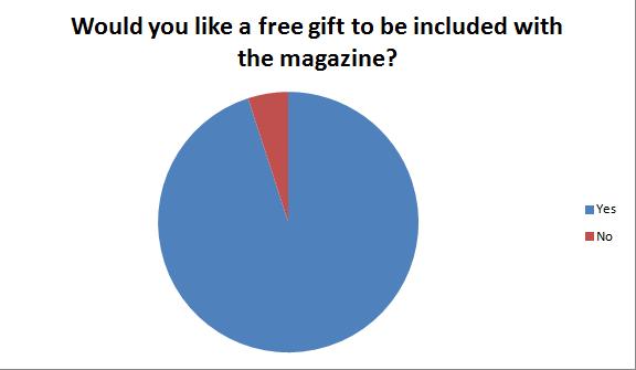
Yes : 19. No : 1.
Out of 20, 19 of the votes decided that they would like a free gift to be included. I may consider adding free gifts on some isses
Yes : 15. No : 5.
Three quarters of the population voted that competitions would encourage them to purchase the magazine and by adding a competition or a giveaway or a chance to meet a certain music artist i think it would be add more appeal and it would stand out from the other magazines out there.
Interviews : 7. Music Charts : 5. Music events and concerts : 5. Posters and fact files : 3.
The main population of my target audience chose that they would want an interview to read about rather than music events or posters. I think an interview with a well known famous celebrity would attract alot of attention and it would be appealing to more people. i also think that by adding music charts and music events and concert would reach out to a bigger audience and by including these it would add more of the recent news to it and whats hot right now. I might consider adding a poster at the back but that is not one of my main concerns, i may create a small fact file if i have enough space but i do not think that is a main concern and is a neccessity to include to would promote my magazine as much as a interview would.
Every Week : 3. Every Fortnight : 9. Every Month : 4. Every Season : 4.
The majority of my target audience chose that they would like the magazine to be released every fortnight with nearly 50 per cent of the votes choosing it and with the other 3 remaining options reaching a peak of 4 votes. I think a fortnightly magazine would be sucessful because it would give me enough time to produce each issue with enough information on and it would have the newest music gossip and news from the music artists aswell every 2 weeks and more people would be able to afford it if its not produced so reguarly. Where as if i released an issue every month or season there would be to much new gossip and information to include and there would be old news and it would need to be updated to much to keep in date with whats going on and a month is a long time for my readers to be kept waiting and they might become intrested in something else within that period of time.
From creating my Questionnaire and asking 7 revelant questions to 20 random girls in my target audience range, i then made my pie charts to calculate my results and view them in percentage and see what was popular and what wasnt. By doing this it would give me a better idea of what my audience want to see and what appeals to them and what doesnt and by allowing them to have input into how the magazine is made they have more likely to purchase the magazine and enjoy it knowing there opinions have been considered and more thought has been put into features like colour schemes and the magazines release date. I have decided to use the results which come up on top and if i dont think they will work i will edit them slightly to match my music magazine style. These pie charts have also helped me compare my results in a easy and organised way and it made it clear what i should choose and what wasnt appealing, hopefully by doing this t would make my magazine more sucessful and interesting for my readers.
Friday, 16 November 2012
My Music Magazine Questionnaire
This is my Music Magazine Questionnaire that i gave to 20 young girls and teenagers ranging from the ages of 11-19. I designed 7 questions that would influence some of the features and the most popular results i would use and add into my magazine. The questions varied from the title of the magazine and colour schemes, but by designing this questionnaire it would give me a better idea of what my target audience wants and what they want to see in a magazine and by calculating the results through pie charts it allows me to see what they want and whats popular and whats not. Im determined to make my music magazine successful and by listening to what the teenagers want to see will hopefully make my magazine more up to date and appealing and more people will want to read and purchase it.
Magazine Cover Mood Board
This is a mood board i created featuring 'pop' themed music magazine front covers and i mainly chose 'billboard' and 'blender' issue's because they have inspired me the most and i want my magazine to live up to the quality that these magazines hold and create an enjoyable music magazine that people will want to buy and read on a regular basis.
All of these magazines have bright colours with a specific colour scheme that follows through the whole magazine. The titles are all big bold and noticeable with fun primary colours, eg: red,blue,yellow, and the celebrity takes the centre of the magazine staring straight into the camera. These covers have inspired me and they have given me some insight into how my magazine should look and what works and how colour schemes need to be consistent and the headings need to be big bold and stand out and make the magazine appealing and more attractive and professional.
Wednesday, 14 November 2012
My Chosen Genre
After researching many different genre's and looking at different music magazines and how there created iv come to a conclusion and have decided to make it into a 'Pop' music magazine with the main artist a boy band like One Direction or JLS and have my target audience focusing on young girls, teenagers and women that would like the boy band and would buy the music magazine to read about them and hear the gossip from them and promote there music aswell.
From researching different music magazines and looking at the different genre's i believe that theres not many 'pop' magazines out there and that my idea of having a boyband would link well with different conventions i could include like a 'exposed interiew' that would draw the girls in and it would be quite a fun magazine to make because it would need to be bright,bubbly and livley.
Tuesday, 13 November 2012
The Music Magazine Industry
Music Magazines are a popular product and thousands are sold every month from different companies featuring different artists from different genres of music.
Music magazines that are popular in the United Kingdom include companies such as 'Q', 'Kerrang!' and 'Mojo' each selling thousands of copies when every issue is produced each month.
Its a tough industry to compete with already so many well known music magazines being sucessful and sold on a regular basis in order to make my music magazine stand out i would need to add different features and include unique things to make it more appealing and attractive to the target audience and potential buyers.
Free Prizes, Famous Music Artists, Interesting and Revealing interviews and New Unheard gossip would all be ways to promote my magazine and make it more saleable and would make it up to the standard that the current music magazines are at.
Research Continued..
For the main double spread page in my music magazine i have been considering different idea's to use and thinking about what would work and what wouldnt.
Different idea's i have been considering would be an interview on my celebrity featuring in the magazine.
An interview on the main celebrity is a common feature used in music magazines and it attracts alot of attention from readers, i think this could be a successful idea and it would make my music magazine seem professional and real its also a good way to engage with readers and from speaking to different family members and friends interviews are always things they look to read when buying a music magazine.
Some other idea's in less detail i have been thinking about would be a 'Celebrity Fact File' introducting the celebrity and them saying there likes there dislikes, it could be an 'All about them' type of file with information about them and there favourite foods,colours etc.
A music chart or music reviews, with the seasons newest music, newest single and album releases, the current songs out and the 'top ten' singles with photos of the celebritys and future music and when its going to be released.
Different idea's i have been considering would be an interview on my celebrity featuring in the magazine.
Some other idea's in less detail i have been thinking about would be a 'Celebrity Fact File' introducting the celebrity and them saying there likes there dislikes, it could be an 'All about them' type of file with information about them and there favourite foods,colours etc.
A music chart or music reviews, with the seasons newest music, newest single and album releases, the current songs out and the 'top ten' singles with photos of the celebritys and future music and when its going to be released.
Saturday, 10 November 2012
Analysing and Rearching different Music Magazine Contents Pages
This are two contents page from the music magazine 'Q' the colour scheme has been kept the same of red, white and black so it has kept consistent which i think is inportant because the readers will recognise this and they will expect this in every isse. There are photos which are linked to the pages which are inside the magazine which i also think is good because it lets them see whats going to be in the magazine further and will link to the articles. The font is also in bulk like figures and is easy to read and i think the overall structure of the magazine is interesting to look at with the headings and page numbers at a slant and how the 'Q' logo is in the same position as the front cover which shows more consistency.
This are two contents pages from the music magazine 'BillBoard' , the colour scheme has also been the same as the front cover and has been carried on to keep the same consistency of blue,yellow,green and pink which are the light pastel colours usually seen on this music magazine. i think the 'number 1 music chart' is a really clever idea to use and is something different to add on to a contents page that will appeal to alot of people and it lets the readers see the current music chart. 'Billboard' have also used pictures relating to the main headings and have placed them around the contents page, i think this works well because its adds more appeal and it encourages people to then want to read the article, it also shows what other celebrity's are going to be featured so it will attract more people to want to buy the magazine.
Looking at different contents pages from published music magazines has inspired me and has given me more ideas to use and adapt for my music magazine. I now believe that keeping a consistent colour scheme that is suitable and matches your genre and target audience is important to use throughout the magazine. I also think that having images on the contents pages that relate to some of the articles further in the magazine works really well because it lets the reader see what they will include and whats going to be in them and it allows them to see if it will interest them. From looking at different contents pages i also think that the structure and layout of them is vital to make them look appealing and attractive to readers, they need to be set out in a professional yet interesting way to make it enjoyable to read and look at and they need to positioned in a sensible way so all the main information can be included and the customers can see everything they need to. i also want to make sure all the right photographs are used and they are suitable for the magazine and they are clear with everything on show that needs to be. In the 'Billboard' magazine contents page i found the music chart a really clever way to engage with the readers and by putting something different on the contents page it has something different that other magazines dont have, i want to make my magazine as appealing as it can be and try and make it unusal and a product that is unique compared to other magazines and by adding these tiny things will make all the difference on the finished product.
Friday, 9 November 2012
Analysing And Researching Different Music Magazine Covers
'BillBoard' is a global music magazine produced weekly devoted to the music industry and the artists in it. And it is one of the oldest magazine still running today, it contains music charts and Internet streaming data. The first issue was made in 1894 and are produced in United States and the current editor is Danyel Smith.
'Vibe' is another well known entertainment and music magazine and is only produced every other month and its target audience are mainly the younger generation or fans of hip hop and urban. The magazine was founded by producer Quincy Jones in 1993 and the current main editor is Jermaine Hall with the head office based in New York City.
'Q' is a well known music magazine founded by Mark Ellen and David Hepworth and is produced in the United Kingdom every month. The first issue was published On October 1986 and the current editor is Andrew Harrison. Most of the magazine is devoted to interviews with music artists and sometimes promotional gifts are given away with different issue's.
From Researching Different Front covers of music magazines it has given me a better insight into what other industrys include and what different conventions they use to be successful and draws target audiences in and what they want to see in order for them to purchase a magazine. From looking at the 6 different covers iv looked at in detail i think that to have the correct color scheme is vital and consistency is very important and the right headlines need to be included so it promotes the cover as best as it can and makes the magazine seem better then all the others. The less important information such as the price and barcode should be placed at the bottom because its still essential but its what the customer needs to know after being persuaded by the information at the top and middle. The photo used needs to be carefully selected and needs to fit in with the issue of the magazine and needs to be a full shot thats clear and easy to see, if its blurry or cropped in a dodgy position it wont look professional and people wont want to purchase or read the magazine if it looks tacky or unprofessional. Any interviews or celebritys included inside should be advertised on the front cover so it will appeal to more people.
Thursday, 8 November 2012
First Task Thoughts
http://emilytownsendasmedia.blogspot.co.uk/
This is a link to my school magazine in which i finished as part of a preliminary task at the start of my media course.
The task was to create a school magazine with a front cover and a contents page appealing to your target audience and promote the school and advertise different events and include different pages on the contents page that would normally appear on a school magazine.
I think that the school magazine was a good starter task to prepare us for our music magazine and give us an idea of what posts to include and what to write on our blogs.
i also think that it was a good way to get us used to the software 'In Design' and made us familiar with the tools and the programme itself, i believe my music magazine will be more detailed than it would have been if i didnt make my school magazine because now im familiar with the software and im used to using and accessing and il be more confident when creating my music magazine.
My main thought is to carefully plan and think about the type of genre my music magazine will be and who my target audience will be and how i can appeal to them and make my magazine to its full potential and make every aspect of it perfect.
Subscribe to:
Posts (Atom)